How to Read The Candlestick Chart
In all markets, be it cryptocurrency, securities or commodities, traders always use charts to analyze the price movements of an asset. Typically, traders prefer to use line, bar or candlestick charts. The line chart makes it possible to analyze the average closing prices. The bar chart analyzes open and close prices, highs and lows and the trading range. But most often traders prefer candlestick charts — they provide more information and are more useful for trading than other charts.
A candlestick chart is a clearer version of a bar chart. It reveals the sentiment behind the market, and allows one to predict all kinds of price movements, displaying them in a clear and readable way.
Attention! This article is for informational purposes only and does not contain recommendations or calls to action.
The review has been prepared by the CScalp terminal team. You can get CScalp by leaving your e-mail in the form below.
What is a candlestick chart?
The candlestick chart is used as a tool to visualize and analyze the price dynamics of securities, derivatives, currencies, stocks, bonds, commodities and so on, over a certain period of time.
A candlestick chart shows how the price developed over a set period of time. It shows the opening price, closing price, maximum and minimum prices, and gives an overview of trading activity over a set time frame (minute, hour, day, month and so on).
A candlestick chart can be built for any time period (timeframe) — be from a minute to a day to as long as a month or even a year. If the TF is set to 5 minutes, then each candle represents 5 minutes of time, if it’s set to 1 week, then each candle represents a week, etc.
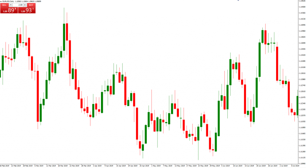
Typical Candlestick Chart
he first trade in the selected time frame will look like a flat line. As trades are made at different price levels, the candle will shift its body up and down following the price movements. The color of the candle shows the direction of the market: if it’s green, then the asset is going up, if it’s red, then it’s going down. Many brokers allow their users to customize candlestick colors.
A candlestick should never be analyzed alone. Its value in technical analysis is derived from its features and its relation to the surrounding candles. Candles often create formations known as candlestick patterns. These are often used to analyze and predict market movements.
Candlestick charts basics
Before you start reading candlesticks charts, let’s learn how a candlestick is made. A candle is a rectangle with two thin lines sticking out of its top and bottom. The rectangular part is called the body; the thin lines are called shadows or wicks.
The length of the body represents the range difference between the opening and closing price within the time period. If the body is colored red, it means that the price closed lower than it opened. Conversely, if the body is colored green, it means that the session closed higher than it opened.
The tips of the wicks show the maximum and minimum prices over the set time frame; they are called ‘the high’ and ‘the low’.
One of the key aspects to pay attention to is the size of the candle: the longer it is, the stronger the stronger the buy or sell mood. A long green candlestick indicates that the sentiment at the end of the timeframe is bullish, whereas a long red candle points to a bearish mood. For a bullish candlestick, the open price is always lower than the close price. For a bearish candlestick, the open price is always higher than the close price.
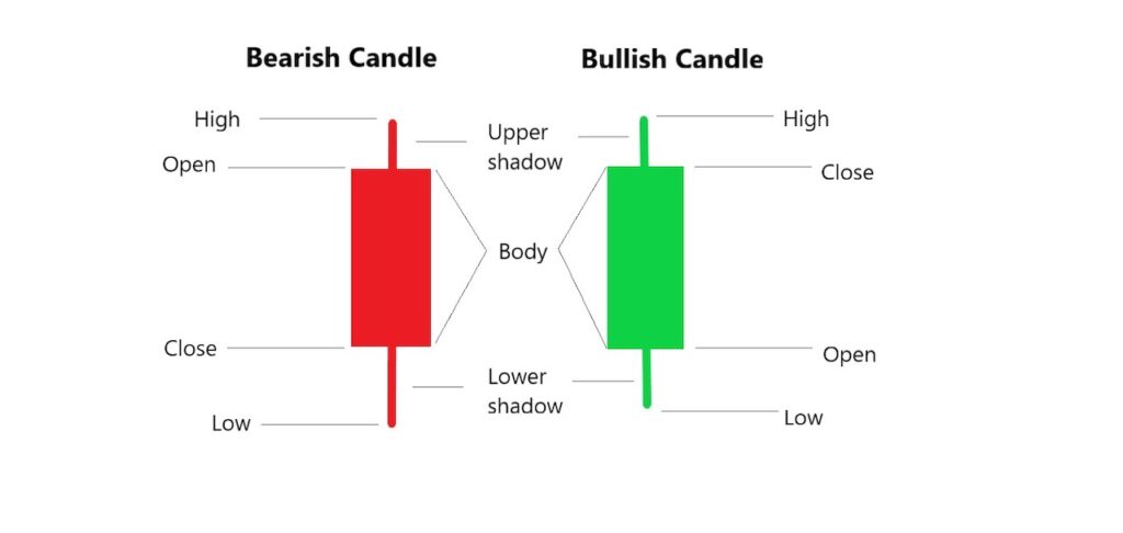
Bullish and Bearish candles
One of the most well-known types of Japanese candlesticks is called Doji. In it, the opening and closing prices coincide or are very close to each other. Such candlesticks have a narrow body, or one looking like a straight line. This figure is worth paying attention to if it is surrounded by candlesticks with longer bodies. Most often, the Doji candlestick shows that a trend reversal is underway.
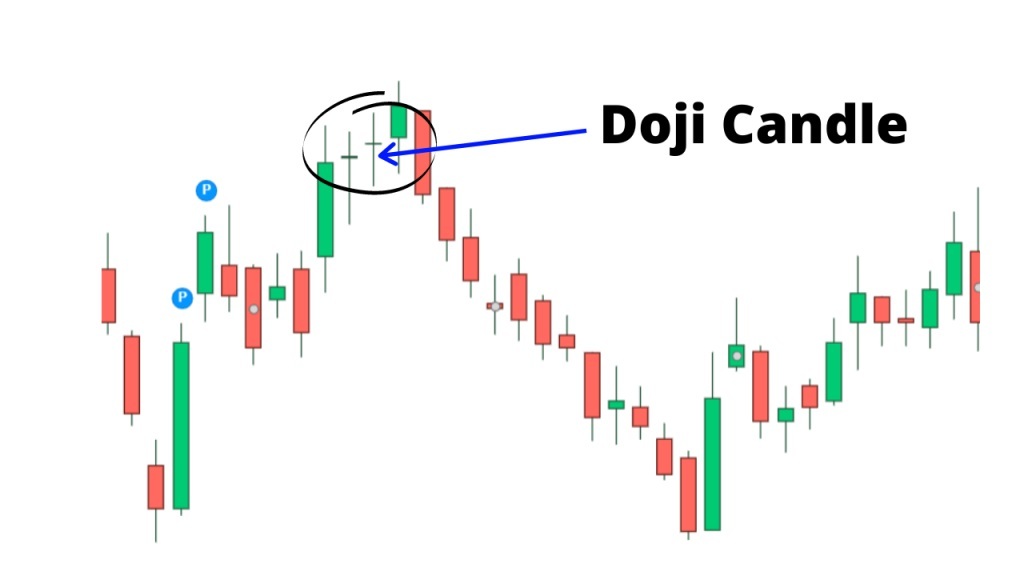
Doji Candle
Note: unlike stock and commodities markets, crypto exchanges are live 24/7. Therefore, the opening and closing price is (most often) both the end of the day and its beginning.
How to interpret candlestick chart patterns
Candlestick charts show the struggle between bulls and bears on a particular time frame. As a rule, the longer the body, the stronger the buying or selling pressure on either side. If the candle’s wick is short, it means that the high (or low) of that timeframe was near the closing price.
The wick is the maximum and minimum of the price for the period set by the user. If there is no wick, it means that the price maximum coincides with the opening price, and the price minimum coincides with the closing price. The wicks show how traders’ mood has changed throughout the day. The color of the candlestick body indicates primarily the price movement. If the body is white or green (but more often green), the price is going up. If it’s red or black, it’s going down.
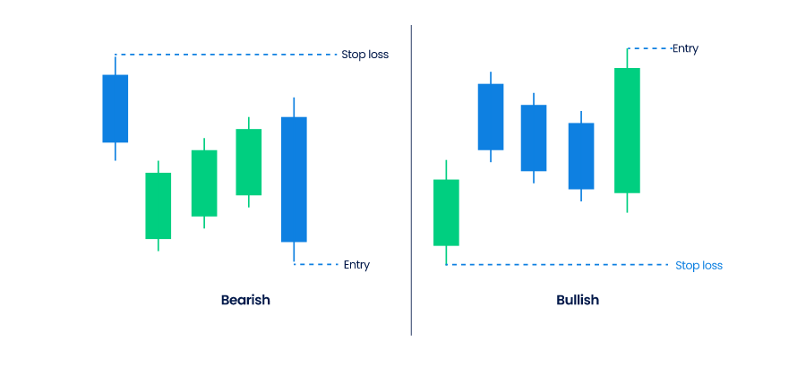
Bullish and Bearish candles
Note: if the body is green, its upper limit indicates the closing price, if it is red, then the candle closed at the lower border.
If you are new to trading, you can start by recording the shapes you notice on the chart in Excel – that way you will remember them faster.
How do I read a candlestick chart? Here are a few basic rules:
- Identify the major highs and lows of the swings on the chart;
- See if the swing points are higher, lower, or at the same level.
On a candlestick chart, you can see one of three situations adding up in the market:
- Swing highs and lows are moving up, signaling an uptrend;
- Swing highs and lows move downward, showing a downtrend;
- Swing highs and lows have the same height, indicating balance.

Candlestick Chart Patterns
As said before, a candlestick usually has no value in and of itself. Candles need to be analyzed in conjunction with other candles. More often than not, adjacent candlesticks form patterns that can help traders read the market. Now let’s consider the main candlestick patterns — the ones that are most often seen by traders and will almost definitely be of use.
Bullish Patterns
Hammer pattern
The Hammer pattern points to a trend reversal.
Visually, such a candle resembles a hammer. It has a small body and a long bottom wick. The upper wick, in turn, is very short.
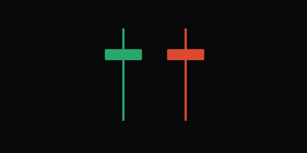
The Hammer pattern
Whenever there’s a hammer, traders tend to go long if the price was falling before, and go short, if the price had been rising.
Hammer pattern
The Inverted Hammer pattern is a trend reversal indicator. It looks like an inverted hammer — with a small body and a long upper wick: the lower wick is very short or nearly absent. At the same time, the upper wick is usually more than twice as long as the body.
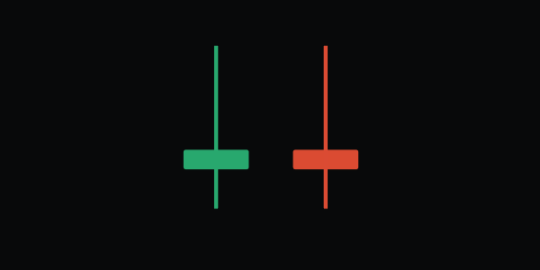
The Inverted Hammer pattern
In such a situation, it is better for the trader to open a position to go up if the price was falling before, and to go down if the price was rising before.
Morning Star pattern
The Morning Star pattern begins with a long red candle.
It is followed by a short red or green candle. The second candle has a small body because it closed next to the price at which it had opened.
The third candle is green; its body overlaps most of that of the first (long red) candle.
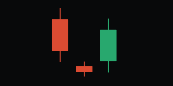
Morning Star pattern
The Morning Star usually indicates a bullish reversal of the current trend. If this pattern is seen on a chart, the price is likely to rise after the ongoing fall.
Note: The larger the body of the third green candle, the stronger the bullish signal.
Three White Soldiers Pattern
The Three White Soldiers pattern is made up of three green candles. The opening price of each successive candle is within the boundaries of the previous candle’s body. The closing price is higher in each subsequent candle.
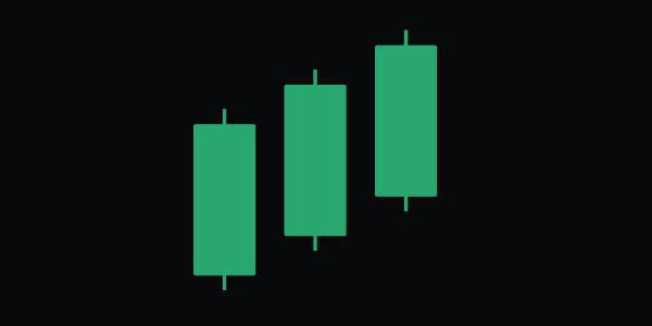
Three White Soldiers pattern
In most cases, the Three White Soldiers signals the continuation of an upward trend.
The Piercing Line pattern
The Piercing Line is a pattern wherein the body of a green candle starts below the body of a red candle. The green candle follows the red one. The closing price of the green candle is near the upper half of the red one’s body.
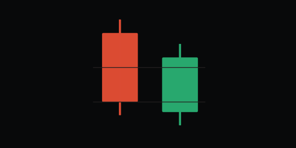
The Piercing Line pattern
As a rule, this pattern signals the beginning of an uptrend. To confirm the signal, other patterns surrounding it should also be analyzed.
Bearish Patterns
The Bearish Engulfing pattern
A Bearish Engulfing is a pattern in which the red candle’s body is longer than that of the green candle. The red candle follows the green one and overlaps it completely. This means that the price of the asset has declined more than it had risen before.
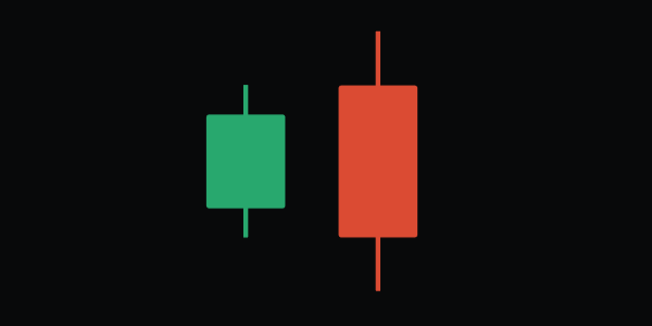
The Bearish Engulfing pattern
As a rule, this pattern signals the end of an uptrend and the beginning of a downtrend.
Bearish Harami Pattern
A Bearish Harami is a pattern wherein a long green candle is followed by a shorter red candle. The body of the red candle is fixed within the boundaries of the green one.
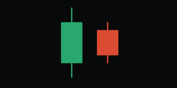
Bearish Harami pattern
This pattern signals the beginning of a downtrend. To determine the trend more accurately, analyze the pattern together with the resistance line.
Evening Star pattern
This pattern is the opposite of the Morning Star pattern.
The Evening Star begins with a long green candle. The next candle is short and can be both red and green. The third candle is red, and its body overlaps most of the body of the first (green) candle.
More often than not, the Evening Star indicates a bearish trend reversal. If this pattern appears on the chart, prices may start to fall after they’ve risen.
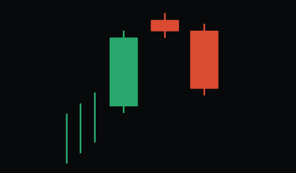
Evening Star pattern
Note two things:
1. The larger the body of the third (red) candle, the stronger the signal;
2. The Evening Star pattern becomes an entry signal only if it is formed after an uptrend.
The Three Black Crows pattern
The Three Black Crows pattern is the opposite of the Three White Soldiers pattern.
The Three Black Crows pattern consists of three descending red candles. The opening price of each subsequent candle is within the limits of the previous candle’s body.
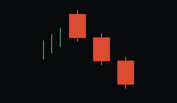
The Three Black Crows pattern
If the body of the first red candle is below the maximum of the green candle that precedes the Three Black Crows, then the signal is especially strong.
Generally, the Three Black Crows indicates that the trend has reversed and the price is going to fall after a rise.
Please note: enter the market using this pattern only if the Three Black Crows formed after an uptrend.
The Dark Cloud Cover pattern
The Dark Cloud Cover is a formation where the body of a red candle starts below the body of a green candle. The red candle follows the green one, with its closing price near the lower half of the green candle’s body.
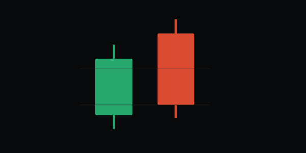
The Dark Cloud Cover pattern
As a rule, this pattern signals the beginning of a downtrend. The Dark Cloud Cover works similarly to the Bearish Engulfing pattern, but it is not as strong. To confirm the signal, analyze other patterns as well.
Key Takeaways
- The candlestick chart is one of the fundamental tools for any trader or investor. It visualizes the price movements of a particular asset, and also provides the necessary flexibility for analyzing data at different time intervals.
- The main advantage of the Japanese candlesticks over other methods of graphical analysis is that it gives the most detailed picture of the market. The candlestick chart model shows the current sentiment of both buyers and sellers.
- In contrast to the “tic-tac-toe” chart, which is not tied to a particular timeline, the candlestick chart allows the trader to notice the smallest changes in the market in real time.
- The color coding of various indicators makes Japanese candlesticks more readable than other types of charts.
- Candlestick charts are universal. They are applicable to all markets, be it currency, commodity, stock, or others.
Join the CScalp Trading Community
Join our official trader's chat. Here you can communicate with other scalpers, find trading soulmates and discuss the market. We also have an exclusive chat for crypto traders!
Don't forget to subscribe to our official CScalp news channel, use trading signals and get to know our bot.
If you have any questions, just contact our platform's support via Telegram at @CScalp_support_bot. We will respond in a matter of seconds.
You can also visit our Discord channel and subscribe to the CScalp TV YouTube channel.
JOIN OUR CHAT
