
Key crypto chart patterns: Unleashing the power of popular trends
The team of crypto trading platform CScalp has prepared a catalog of the main technical analysis patterns that you can often discover when trading. It is divided into trend reversal patterns, trend continuation patterns and indeterminate patterns.
Attention! This article is for informational purposes only and does not contain recommendations or calls to action.
The review has been prepared by the CScalp terminal team. You can get CScalp by leaving your e-mail in the form below.
Understanding the importance of crypto chart patterns
Chart patterns play a crucial role in technical analysis and are of paramount importance for traders and investors. They provide valuable insights into market sentiment, price trends and potential trading opportunities. Here are some key reasons why understanding chart patterns is essential:
Price pattern recognition
Chart patterns allow traders to visually identify recurring tendencies on charts. These patterns reflect the collective psychology of market participants and provide valuable information about potential future price movements. By recognizing and interpreting these patterns, you can anticipate market behavior and make informed decisions.
Market trend identification
Chart patterns help identify the prevailing market trend, whether it is bullish, bearish or flat. Patterns such as uptrends, downtrends, and sideways consolidation can be identified, enabling traders to align their strategies with the overall market direction. Recognizing trend patterns helps you avoid counter-trend trades and focus on opportunities that align with the dominant market trend.
Entry and exit points
Chart patterns offer insights into an optimal entry and exit points. Bullish patterns indicate potential buying opportunities, while bearish patterns suggest potential selling opportunities. You can use chart patterns to time your entries and exits more effectively, increasing the probability of capturing profitable moves and minimizing losses.
Confirmation of technical analysis signals
Chart patterns act as confirmation signals for other technical analysis tools and indicators. For example, if a bullish chart pattern forms at a support level identified by a moving average, it reinforces the bullish bias. By combining chart patterns with other technical indicators, traders can strengthen their analysis and enhance the reliability of trading signals.
Market psychology and sentiment analysis
Chart patterns reflect the psychology and sentiment of market participants. For example, patterns like double tops and head and shoulders suggest potential reversals due to a shift in sentiment from bullish to bearish. Understanding market psychology through chart patterns helps traders gauge the emotions driving price movements, facilitating better decision-making.
Market timing and trade planning
Chart patterns assist in market timing and trade planning. Traders can anticipate potential breakouts or breakdowns from chart patterns and plan their trades accordingly. By identifying patterns with specific price targets and timeframes, traders can develop well-defined trading plans and execute them with precision.
How to read crypto chart patterns?
A pattern is a recurring sequence of elements in a certain order. Financial markets and price charts also exhibit patterns, and it’s the traders’ job to seek out and leverage them.
There are two types of patterns in a market: candlestick patterns and chart patterns. Candlestick patterns are recurring sequences of several candlesticks in a row – usually 3 to 5. These appear along trends or sideways movements, and they help us predict upcoming price changes.

Typical candlestick patterns: 2-3 candlesticks in a row
Chart patterns are also recurring formations on the price chart – except these take a lot longer to form (usually from 10 candles upwards), and they help us predict border changes in the market behavior. Chart patterns resemble geometric figures – most often some sort of triangles or flags. Taking note of the type and direction of a chart pattern, a trader gets a signal about the upcoming price movement.

Typical chart pattern: 10 to several dozen candles; complex figures
Patterns are based on chart observation. Traders have noticed that price charts can coalesce into distinct figures; these, in turn, trigger certain types of price movements.
Most patterns are determined visually. There is no definitive set of rules as to where and how to draw them. A little tip is not to overthink it and only stick to patterns that seem obvious. The rule of thumb is: if you can see it, then most likely everyone else does. For convenience, you can use the drawing and line tools available in trading terminals. CScalp, for instance, offers straight line and beam tools to mark chart patterns when scalping.
A pattern may serve as a signal to open a position. The extent to which this is true depends on the timeframe. More often than not, if a chart pattern emerges on larger timeframes (4H/1D and upwards), then most other traders see it too, and base their analyses on it. Thus, a pattern works much like a self-fulfilling prophecy. If used with smaller time frames, however, patterns become much less reliable, as the market generates a lot of noise at all times. What seems to be emerging as a clear 5-m pattern may break at any moment, rendering any of its analysis worthless. Either way, it’s not recommended to base your analysis just on chart patterns. A candlestick pattern should only be viewed as a confirmation of the already formed hypothesis.
Types of crypto chart patterns
Broadly speaking, there are two types of chart formations: trend reversal and trend continuation patterns. The former means that the current trend is about to head in the opposite direction, while the latter tells trend traders to keep calm and carry on. Some patterns are universal – their signal will depend on the trend and their exact placement on the chart.
Chart patterns are mostly used by medium-term and intraday traders. Their readings mostly depend on the trader’s strategy. The rule of thumbs is: the more complex a pattern is, the larger the timeframe needed to work with it.
Of course, patterns cannot guarantee that the market will go exactly as predicted. But the search and correct reading of patterns will help the trader to determine the trend, assess market dynamics, and find possible entry and exit points.
Learn more about types of chart patterns in trading.
How to boost your understanding of crypto chart patterns
Before we begin, a little note on how to make the most out of chart patterns. The thing about patterns is that searching for them can get overwhelming. Many beginner traders find themselves wondering: is this the right angle? Does this qualify as a pattern? The answer is your exposure and practice. In order to recognize chart patterns with confidence, you first need to see a lot of examples of already existing ones, preferably made out by professional traders. On that front, the CScalp team has got you covered.
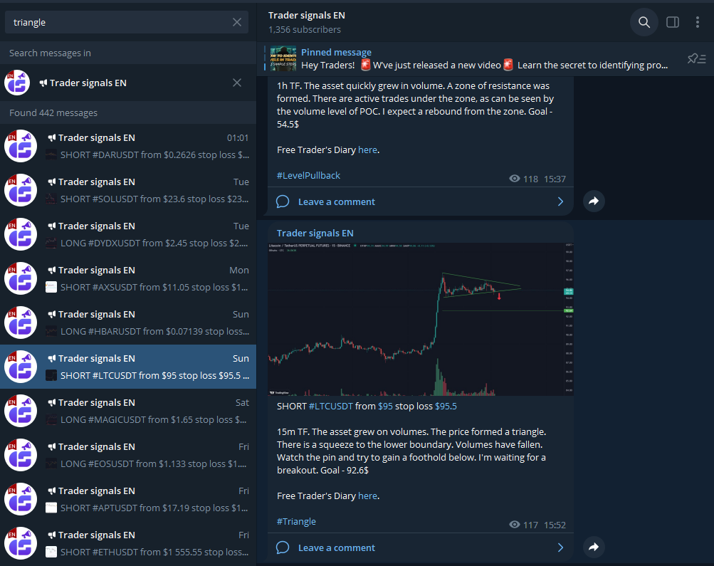
To see real candlestick patterns in action, as well as other aspects of proper market analysis, feel free to join the CScalp trader signals channel. Traders verified by our team are sharing their ideas there. The channel is 100% free, as are all the other products by CScalp.
How to leverage the channel to better learn crypto chart patterns?
Join the channel using a link on CScalp main page and open the search bar. As you go along, learning about patterns in this article, search for each one of their names in the chat and read the trading signals they have appeared in. Take note of the author’s reading of the pattern – does it look accurate or more like guesswork or overthinking? Would you have spotted this pattern yourself? Why? Try to get down to the reasoning behind finding this pattern.
You can further enhance your learning like this: open the CScalp terminal. Load up the charts for the instruments you’ve just read about. Try to identify these patterns on the charts. How did the price behave after the signals were posted? How did patterns work with the levels around them?
Try to make a habit of studying other traders’ signals regularly. However, be critical of the author’s reasoning and keep in mind that a signal is never a call to action. It’s merely another trader’s hypothesis that can always turn out wrong. Only use a signal if you understand it and agree with it.
After that, you can try to find some patterns yourself. Mind that chart patterns are never geometrically perfect, but they can be very distinct. Use different time frames – some patterns are exclusive to one TF, while others extend into larger ones. Once you’ve spotted a pattern, look at it from different angles. What levels are found near it? Were volumes increased while it was forming, or did they not change (check Volume technical indicator)? If you can’t find a pattern from this list no matter how hard you try, forget about it, you’ll meet it later on elsewhere.
Using crypto chart patterns to enhance trading strategies on CScalp
Chart patterns serve as valuable tools for traders on the CScalp platform, enabling them to make informed trading decisions based on historical price patterns. By effectively identifying and analyzing chart patterns, traders can enhance their trading strategies and increase the probability of successful trades. Here are some key considerations for utilizing chart patterns to enhance trading strategies on CScalp:

Confirming chart patterns with indicators:
While chart patterns provide valuable insights, it’s important to confirm their validity using technical indicators available on CScalp. Indicators such as moving averages, oscillators, and volume indicators can help validate the presence of a chart pattern and provide additional confirmation signals. By combining chart patterns with indicators, traders can enhance their decision-making process and improve the accuracy of their trades.
Timeframe selection for crypto chart patterns:
Different chart patterns may exhibit varying levels of reliability and effectiveness across different timeframes. Therefore, it is crucial to consider the timeframe you are trading on CScalp when analyzing chart patterns. Shorter timeframes like intraday charts may provide more frequent chart patterns, while longer timeframes like daily or weekly charts may offer more robust and significant chart patterns. Adapt your trading strategy accordingly based on the timeframe that aligns with your goals and preferences.
Incorporating multiple chart patterns:
Rather than relying solely on a single chart pattern, it is often beneficial to incorporate multiple chart patterns in your trading strategy on CScalp. By analyzing the presence of different patterns, such as a combination of a bullish reversal pattern and a continuation pattern, traders can gain a more comprehensive view of the market sentiment. This multi-pattern approach can strengthen confidence in trade setups and increase the likelihood of successful trades.
Proper risk management:
While chart patterns can provide valuable trade setups, it is crucial to employ proper risk management techniques when executing trades on CScalp. Set appropriate stop-loss orders and define target levels based on the price action and pattern characteristics. By managing risk effectively, traders can protect themselves from adverse market movements and preserve capital in the event of potential pattern failures.
Continuous learning crypto charts:
Chart pattern analysis is a skill that improves with continuous learning and practice. Stay updated with the latest resources, educational materials, and insights related to chart patterns and their application on CScalp. Engage in backtesting and paper trading to validate the effectiveness of your trading strategies based on chart patterns. By honing your chart pattern analysis skills, you can gain a competitive edge and improve your trading performance on CScalp.
Incorporating chart patterns into your trading strategy on CScalp can provide valuable insights and improve the probability of successful trades. Regularly evaluate and refine your trading strategy based on the performance of chart patterns and adapt to changing market conditions to achieve consistent profitability on CScalp.
Trend reversal patterns
When head and shoulders, double/triple top/bottom patterns appear, a change in the current trend or a serious price correction is likely. Often, such figures are formed at historical highs or at strong support/resistance levels.
Head and shoulders
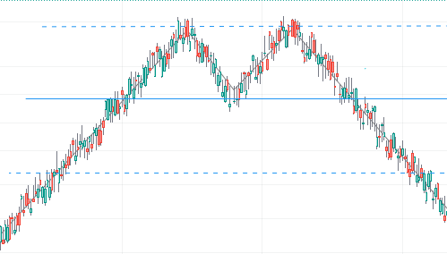
The head and shoulders pattern is made up of three adjacent peaks.
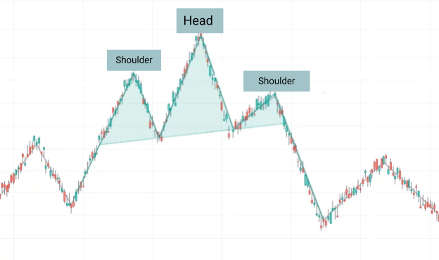
The middle (head) is the highest, with the ‘shoulders’ being approximately at the same level.
Entry points often occur when the neckline is hit at the beginning of the second shoulder, or when the price is tested after the breakout. In a downtrend, this pattern is mirrored.
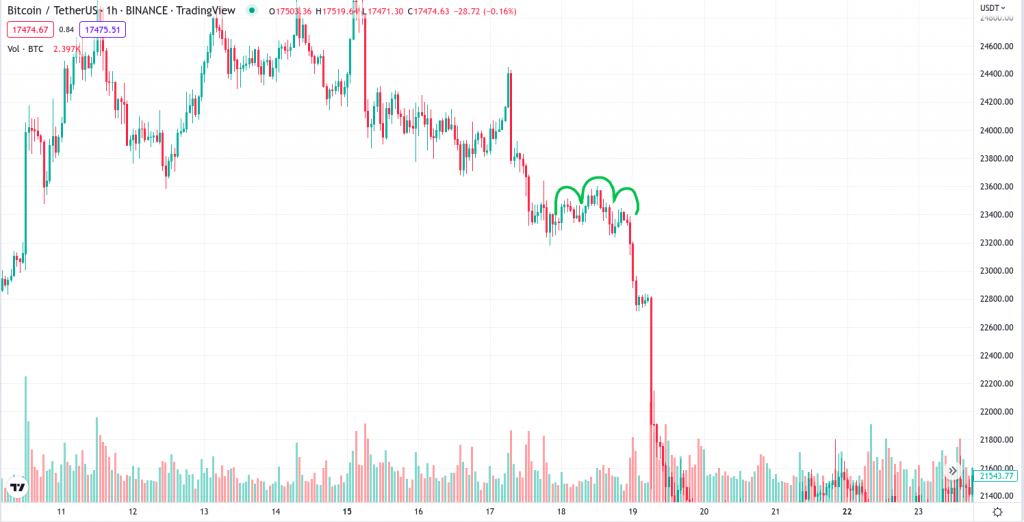
Double Top and Double Bottom
This pattern consists of two or three tops or bottoms that have hit – but haven’t gone past – the same price level. After a failed attempt to break out, the price returns to the last low (or high), after which it turns around and breaks through the low/high.
A double and a triple peak are formed in the same way. The only difference is whether the support line is broken after the second or third peak. Scalpers usually look for entry points after the breach of the level or its subsequent testing.
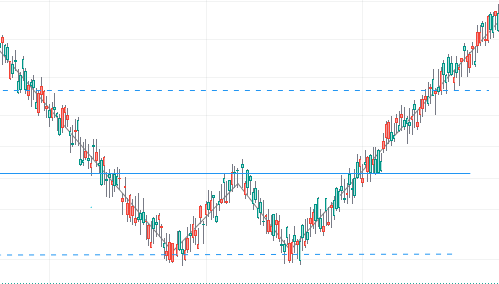
A double or triple bottom is formed and works in the same way, only mirrored.
Diamond
The Diamond pattern is a signal for a possible trend reversal. Sometimes it’s also called “Rhombus” or “Crystal”. The diamond looks like a quadrilateral figure with corners facing hard up, down, left and right. The top and bottom corners are approximately on the same axis, a slight offset is allowed.

Graphic pattern “Diamond”
During the formation of a diamond, the local price extremes first move away from each other, then approach each other again. For example, if the pattern appears on a downtrend, then the lows will be updated, each top being further from the previous low. After the peak divergence (central axis), the lows will increase and the highs will decrease, narrowing the right corner of the diamond.
If a diamond forms during an uptrend, the price may fall right after it. And vice versa – appearing on a downward movement, the diamond often signifies a reversal up.

Graphic pattern “Diamond”
If a diamond forms an uptrend, the price may fall right after it. And vice versa – appearing on a downward movement, the diamond often signifies a reversal up.
Bullish and Bearish Engulfing
The engulfing pattern is a simple candlestick pattern that appears on larger timeframes. It’s usually seen on the decline of a strong trend. Engulfing consists of two candlesticks, so it does not quite fit into the concept of a pattern. Nevertheless, this pattern can be interpreted as a geometric figure – most often a rectangle.
There are two types of engulfing: bearing and bullish. Bullish engulfing is two strong, long candlesticks formed at the low price of the current price trend. The first candle is red, the second is green. They denote the end of a prolonged series of sales and point to a strong rebound. Bullish engulfing appears right at the end of a global trend, so whenever you see one, know that the price is most likely to make a strong impulse move up.

Graphic figure “Tube-shaped bottom”, highlighted in blue
Its mirror image is the Bearish Engulfing. It looks and works in the exact same way, only in reverse. The first candle is long and green, indicating a buying spree. The second one is red, showing a drastic change of sentiment towards selling. Found at the end of definitive upwards movements, Bearish Engulfing signifies a turn for a downtrend.

Graphic shapes “Pipe top”, highlighted in blue
Three crows
The Three Crows pattern is sometimes called the Three Black Crows, “black” meaning that the market growth is over and it’s time for bears to step in. Again, this is not exactly a chart pattern, but rather a basic candlestick pattern. Nevertheless, it’s very useful and easy to find. It is formed by three red candles and signifies the transition from the growth phase to a fall.

Graphic figure “Three black crows”, highlighted in blue
To correctly interpret read this pattern, you need to consider the length of the previous green candles. Three red candles are usually considered “black crows” when their combined length exceeds the combined length of the previous three green candles. Sometimes the appearance of crows is preceded by a slight correction. In this case, the “three crows” signal a confirmation of the sell trend.
The Dragon
The dragon is a rare and complex pattern that heralds a trend reversal. It consists of four points – the “head”, the “front paw”, the “hump” and the “hind paw”. The “Head” is the starting, upper point of the figure. This is a candle that ends a sideways move/slight uptick phase. Right after it, a series of sales begins.
The second point is formed when the sales end, an upward correction and a series of green candles appear. The second point is the “front paws”. The dragon’s “hump” is the candle where the growth is interrupted and a decline begins. After the hump, selling continues until the price lands on its “hind legs” – the second local low. After the hind legs, a major trend reversal begins, viewed as the dragon’s “tail”. It is on the “tail” that traders usually start to buy

Pattern “Dragon”. Number 1 indicates “head”, 2 – “front legs”, 3 – “hump”, 4 – “hind legs”
In a classic dragon, the front legs are slightly lower than the hind ones (by about 10-15%). That is, the first candle is ‘cheaper’ than the one forming the hind legs.
The line drawn from the “head” to the “hump” should be downward. In this case, both paw candles are placed below this line. The Hump is placed 30-50% down the line, not lower. The fifth point is arbitrary – this is the place where the head-hump line crosses the chart after the price bounces off its hind legs. If you connect all the points with lines, you get a zigzag, narrowing towards the end. For a more accurate calculation of the distances between points, you can use Fibonacci levels.
The dragon can be bearish – appearing after a strong buy dynamics. In this case, the head is the exit point from the market flat before the growth phase. The rest is symmetrical: the first paw is the end of a long series of purchases and a small correction, with a short-term price drop; the tail is a reversal of a large trend coming from the dragon’s head.
Trend continuation patterns
After the completion of the trend continuation pattern, the price is most likely to move in the same direction. The main trend continuation patterns are pennants, flags and rectangles.
Rectangle
Figure rectangle (range, corridor, consolidation) on the chart is formed from horizontal support and resistance lines. The quote falls into the range after strong price impulses. The longer the price is in the range, the higher the probability of breaking the border.

Graphic figure “Rectangle”
Flag
Pattern borders flag directed against the main trend. Usually, the figure appears after strong price movements. The flag pattern may indicate that the bears took the correction for a reversal. It is possible to break through the boundaries of the channel and continue the trend in the same direction. Traders open a position after the borders are broken flag in the direction of the main trend.
Bullish Flag
In a Bullish Flag, the price moves up and then consolidates in a narrow range. The highs and lows of the correction make up the boundaries of the flag. When the upper limit of the bullish flag is broken, the main trend is most likely to continue.

Graphic figure “Bull flag”
Bearish Flag
The bearish flag pattern is characterized by falling prices. After, the price consolidates and continues to move in a narrow range. When the lower border of the bearish flag is broken, the downtrend is most likely to continue.

Graphic figure “Bear flag”
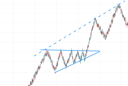
Pennant
Pennant is formed similarly to a triangle. The key difference is that the upper border of the pennant is directed downwards and the lower one is upwards. Usually, the pattern appears after strong impulsive movements in the direction of the main trend.
Bull pennant
The bull pennant resembles a symmetrical triangle. As a rule, it means the current bullish trend continues. After breaking through the upper boundary of the pennant, a price impulse about the size of the pennant is possible.

Graphic figure “Bull pennant”
Bear pennant
Bear pennant is a mirror image of the bullish. The figure appears after a strong price decline and ends with the appearance triangle in the form of a pennant. Usually bear pennant continues the bearish trend.

Graphic figure “Bear Pennant”
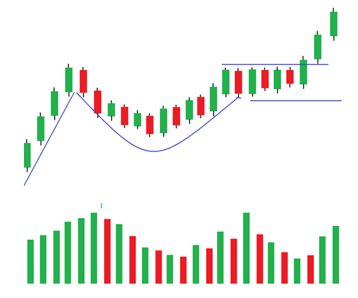
Cup and handle
Cup and Handle is a complex pattern that signals the continuation of a trend. It forms in a bullish market and can serve as a signal for opening a long position. The conditions for the appearance of the ‘cup’ often include several attempts by the bears to disrupt the bullish trend. It usually appears after a price surge and several long green candles.

Graphic figure “Cup with handle”. The initial “bullish” jerk is highlighted in orange, the main phase of the struggle between sellers and buyers is highlighted in red.
After the bull run, the struggle phase begins. It forms a new low, which is then shifted higher. At the same time, the highs are not updated – volatility is concentrated below the horizontal line drawn from the last rush. As a result, the price minima draw a semicircle. The cup phase continues until the lows are restored to the original position.
Once the cup has shaped up, the bears attempt to bring the price down again – and that’s when the “handle” is formed. If the bulls appear stronger, then the uptrend will continue.

Graphic figure “Cup with handle”. The initial “bullish” jerk is highlighted in orange, the main phase of the struggle between sellers and buyers is highlighted in red.
The less common version is its mirror image – an inverse cup and handle. It occurs during the bearish trend and signals its continuation. The cup phase is formed not by lows, but rather by highs, and also looks like an arc. Everything else about the inverse C&H works exactly the same but in reverse.
Undefined patterns or bilateral figures
Indefinite patterns can inform the trader of both trend continuation and reversal. The direction of the price depends on the slope of the pattern lines in relation to the current trend.
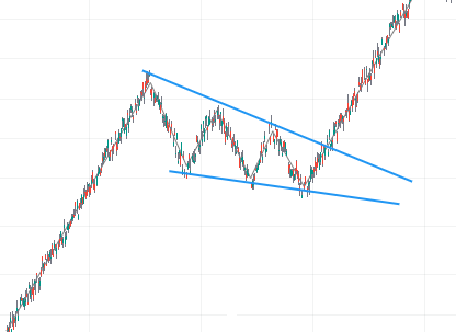
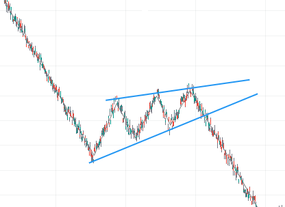
Triangle
A triangle is formed when one local level is approaching the other, with the other one being flat. The figure is often referred to as a trend continuation pattern. Where there’s a triangle, there’s a chance of a trend reversal.
Ascending Triangle
An ascending triangle has a flat resistance line. The lows are higher with each wave, making the price range tighter. Usually, before going long off a triangle, traders take into account the fact of a breakdown of the resistance line or a rollback to it.

Ascending Triangle
Descending Triangle
In a descending triangle, one side of the pattern is formed by a flat support line, while the other one is formed by declining highs.

Descending Triangle
A descending triangle is the exact opposite of an ascending one. With this figure, traders are looking for entry points after the breakdown of support or a rollback to it.
Note: Ascending and descending triangles can be seen in both bearish and bullish markets.
Symmetrical Triangle
A symmetrical triangle reflects a situation where the highs are lower and the lows are higher. Both sides of the triangle have the same angle.
With this pattern, it’s usually hard to predict the following price movement. A breakout can trigger a price move roughly the size of the wider side of the pattern.
Wedge
Unlike triangles, wedges do not have a flat side – both edges are tilted in the same direction.
Bullish Wedge or Descending Wedge
In a bullish (descending) wedge, local lows are updated while the price movement gradually slows down.
The highs and lows of the wedge are approaching each other. Therefore, in a growing market, a bullish wedge normally looks like a small correction. Traders will typically go short after the breach of the upper limit of the bullish wedge.
Bearish Wedge or Ascending Wedge
A bearish (ascending) wedge is formed similarly to a bullish one. The difference is that local maxima are gradually updated.
The price movement slows down in the narrowing range. A bearish wedge may be a sign of a trend reversal or a subsequent correction.
Three Indians
The Three Indians is a pattern formed along a trend line. Sometimes it’s also called “The Three Touches”. The second name accurately reflects the meaning of the pattern. The price must touch the drawn line three times in order for the trader to perceive the figure as a signal for a deal.

The graphic figure “Three Indians” is shown in blue and light blue. Touches of the trend line are marked in red
Three Indians can be used as a trend reversal indicator or as a confirmation indicator, depending on the type of pattern that has developed. For example, if the pattern touches the lows (the line drawn below the candles), with each low being higher than the previous one, then this is a signal to continue the bullish trend. If the line is drawn above the candles, touches three highs, and each high is higher than the previous one, then we can expect a trend reversal and a price drop.
On a downtrend, the pattern is read in reverse. Three lows, each lower than the previous one, mean a continuation of the bear market. Three highs, each lower than the previous one – a trend reversal to growth.
Golden Cube
The Golden Cube is a rare pattern found during sideways movements. It’s viewed as a signal to continue the flat. However, it may also appear in a stady trend, in which case it’s a continuation signal. The Cube looks like four candles almost equal in size. The candles closely resemble a square. The height of each candle should be roughly equal to the width of the four candles combined.

Figure “Golden Cube”, highlighted in blue
In a golden cup, the candles are allowed to differ slightly in body length. The length of the wicks does not matter. It is important that the candles are not too long relative to the adjacent ones. Otherwise, the figure can be interpreted as a spike and a trend reversal signal.
Harmonic patterns
Harmonic patterns are complex patterns made up of at least five points. Their interpretation depends on the type of figure and its proportions. That is, the pattern signal should be taken into account only if it meets certain criteria.
Proportions in HPs are defined as retracement levels (in some sources – correlation). Simply put, each point of the figure should rise above, or roll back from, the previous price point. Only then can the point be considered an element of the pattern.
Most often, harmonic patterns are calculated with the Fibonacci Retracement tool. Modern analytical platforms and terminals also have auxiliary tools – templates to measure the patterns by. For example, TradingView has a “XABCD Template”. The trader only needs to plot five points on the chart (X, A, B, C, and D), and the indicator will automatically calculate the proportions between them. If the resulting proportions match those of a pattern, then the figure can be seen as valid.
Gartley Butterfly pattern
The Gartley Butterfly is a pattern consisting of five points. Generally, it looks like two triangles intersecting in one place. The first dot of the butterfly is placed on a top candle, at the beginning of a sharp decline in price. The second point is a candle that concludes a series of sales before a reversal. It is sometimes called the left “wing” of the butterfly. After that, the price rises to a relatively high level again, but no higher than the start of the pattern. Thus, the first “wing” is formed as a triangular figure.

“Bullish” version of the “Butterfly Gartley” pattern
After the first wing is complete, the price goes down again, to a level close to the lower corner of the first “wing”. The price doesn’t actually have to reach the exact same mark as in the first wing. The angle of the second wing may be slightly higher or lower. Visually, it forms a second triangle adjacent to the first one. The subsequent bounce continues until the price rises higher than the point of convergence of the two “wings”. After that, the pattern is formed.
In a standard Gartley Butterfly, the distance from A to B is approximately the same as the distance from C to D. In harmonic patterns, this principle is known as “AB=CD”. In this case, if you draw segments between AB and CD, they may turn out almost parallel.
The first point is designated as “X”. If the segment drawn from X to A goes from bottom to top, and from C to D – from top to bottom, such a butterfly is regarded as bullish. After its formation, the price of the instrument is expected to rise. If the beam from X to A passes from top to bottom, and then C to D from bottom to top, then it’s a bearish butterfly portending a price drop.

Showing the main types of harmonic patterns with ideal proportions
The important point here are the proportions of the butterfly. They depend on the ratio of corrections. For an ideal pattern, XB corresponds to 0.61, AC – 0.78, BD – 1.27, XD – 0.78. Many charting services (for example, TradingView) have special tools that allow you to build XABCD patterns and automatically calculate corrections.
Bat
The Bat figure also belongs to harmonic patterns. Visually, it resembles the Gartley Butterfly, but with different proportions.

Bat pattern (“bullish” variant)
The ‘bull’ bat consists of two triangles, whose acute angles are pointed upwards (points A and C). The line from X to A goes from bottom to top, and from C to D – from top to bottom. The bearish bat has its angles pointed down, the XA line going from top to bottom, and the CD line going from bottom to top.

Bat pattern (bearish version)
Visually, the bat differs from the “Gartley Butterfly” in that it has narrower ‘wings’, especially at points A and C. The proportions of the patterns are best measured with Fibonacci levels. Also, TradingView has a harmonic pattern measuring tool tailored specifically for patternsof this kind. The ideal proportions of a Bat are: XB – from 0.32 to 0.50, BD – from 1.61 to 2.61 , AC – from 0.38 to 0.88. The most important segment is XD. Here, the ideal correlation parameter is 0.886. That is, the price of point D correlates with the price of point X by 0.886%. In other words, the X-point candlestick is slightly higher than the D-point candlestick in a bearish pattern (and a little lower if the pattern is bullish).
The Crab
The harmonic pattern “Crab” may signify the emergence of a new trend, depending on the position of the figure. A bull crab is a five-dot pattern where the first dot is higher than the fifth. The remaining three points are higher than the line drawn between the first and fifth. The segment drawn from the first to the second point goes up. The part drawn from fourth to fifth is facing down. In a bear version of the crab, the first and fifth points are higher than the rest. The line from the first to the second point goes from top to bottom, from the fourth to the fifth – from bottom to top.

Crab pattern, shown in blue
A crab can be told apart from a “bat” by the central point (B). If you draw a conditional X-D line, in the crab the point B will be noticeably lower than this line. This point will be closer to the ‘floor’ of the pattern in the bearish version and to the ‘ceiling’ in the “bullish” one. In the bat, point B is much closer to the center of the figure.
The ‘Ideal’ proportions of this pattern are: XB – from 0.38 to 0.61, BD – from 2.24 to 4.23, AC – from 0.38 to 0.88. The ideal correlation ratio between XD is 1.618.
The Shark
A Shark is another harmonic pattern close to the Butterfly and Bat patterns. The key difference between them is that in the Shark, the last point is much higher than the starting point. This makes the figure appear slightly shifted.
If you draw conditional lines from the first point to the second, from the second to the fifth and from the fifth to the first, you get a narrow triangle with an acute angle at the last point of the figure. Shark points are usually referred to as 0XABC (for other harmonic patterns – XABCD). This is due to the fact that the Shark can shift into a 5-0 pattern. Accordingly, the 5-0 pattern will start from point X, the second point of the Shark.

Shark pattern. Left side is bullish, right side is bearish.
The ideal Shark has the following correlation proportions: XB – from 1.13 to 1.61, AC – from 1.61 to 2.24, 0C – 1.13. The bullish Shark has the 0C segment at the bottom of the figure. Line 0X goes from bottom to top, line BC goes from top to bottom. Point B is above point X, point A is below points X and B. In the “bear” Shark, the 0X line is directed from top to bottom, the BC line is from bottom to top. Point B is below point X, point A is above points X and B. Segment 0C is placed at the top of the figure.
5-0
The 5-0 pattern is five points arranged along the extremes of the chart, taking into account the correlation between individual points. The points are marked XABCD.

“5-0” pattern, shown in purple
In the bearish variation, the starting point (X) is placed higher than the second point (A) and forms the first triangle together with the third point (B). B sets well above A, at a price high. The points C and D are placed at the next low and high respectively. This, two triangles are formed – XAB and BCD.

The 5-0 pattern combined with the Shark pattern. 0 is the first point of “Shark”, X is the first point of “5-0”. C is the last point of “Shark”, D is the last point of “5-0”. On the left is a bullish 5-0 option, on the right is a bearish one.
Unlike in other harmonic patterns, the triangles in 5-0 can be visually very different, both in the direction of sharp corners and in their surface area. The bullish version is formed in a mirror-like fashion: X is below A, A is above B. The AC segment is in the upper part of the figure, BD is in the lower one.
For the correct formation of the figure, the following correction parameters are sought after: XB segment – from 1.13 to 1.61, AC – from 1.61 to 2.24. The BD segment should be close to 0.50.
Harnessing the predictive power of crypto chart patterns
Crypto chart patterns play a vital role in predicting market developments and price changes for crypto instruments. It’s important to note that technical analysis patterns do not guarantee market movement in a specific direction. However, when used alongside fundamental analysis, technical analysis provides traders with a deeper understanding of the crypto market. By leveraging the insights gained from chart patterns, traders can make more informed decisions and navigate the dynamic landscape of cryptocurrency trading with confidence.
Join the CScalp Trading Community
Join our official trader's chat. Here you can communicate with other scalpers, find trading soulmates and discuss the market. We also have an exclusive chat for crypto traders!
Don't forget to subscribe to our official CScalp news channel, use trading signals and get to know our bot.
If you have any questions, just contact our platform's support via Telegram at @CScalp_support_bot. We will respond in a matter of seconds.
You can also visit our Discord channel and subscribe to the CScalp TV YouTube channel.
JOIN OUR CHAT